Share Your Color Direction
Send brand guidelines, mood boards, photos or preferred colors, and explain the audience and atmosphere you want the set to convey.
Press Enter to search or ESC to close
Color is one of the strongest ways to distinguish an American Mahjong collection. FENGZHE works with brands, retailers and designers to develop acrylic color combinations that express a specific visual identity, from soft pastel and coastal-inspired palettes to saturated jewel tones and understated neutrals.
Our team reviews your mood board, brand colors and product references, then helps translate those ideas into practical acrylic selections. We consider the appearance of transparent, translucent, opaque and marbled materials, the relationship between tile faces and edges, and the contrast required for clear, readable Mahjong symbols.
Physical swatches and approved samples are essential: colors may look different on a screen, in natural light and under retail lighting. We help organize the approval process so the finished collection follows a clearly defined color direction.

Whether you have exact brand references or only a visual concept, our color-development workflow helps clarify materials, contrasts and approvals before bulk production.
Send brand guidelines, mood boards, photos or preferred colors, and explain the audience and atmosphere you want the set to convey.
Compare transparent, translucent, opaque and specialty material options based on the desired look and practical availability.
Review how tile-body colors interact with engraved or printed symbols, edge bands and special tile artwork.
Use material references or samples to assess actual color appearance, lighting differences and contrast.
Check a physical tile for color, finish, handling, legibility and coordination with the approved palette.
Document approved color references, artwork versions, set contents and packaging before manufacturing.
Choose the visual mood of your collection and explore how acrylic transparency, color depth, tile edges and artwork can work together. Every final material combination is subject to sample review.
We help translate brand references into coordinated tile-body colors, accents and finishes while considering the readability of American Mahjong symbols and the visual consistency of the complete set.

Compare physical acrylic samples and approved finished tiles before confirming production colors.
A polished collection brings tile bodies, face artwork, accessories and retail packaging into one recognizable color system. These decisions are reviewed together rather than one at a time.
Coordinate symbol colors with tile-body colors so numbers, suits and Jokers remain easy to distinguish.
Review racks, cases, inserts and other accessories to create a unified color story across the set.
Connect gift-box artwork, labels and instruction cards to the selected Mahjong palette.
Assign clear references to each approved colorway so sampling and production use the correct material combinations.
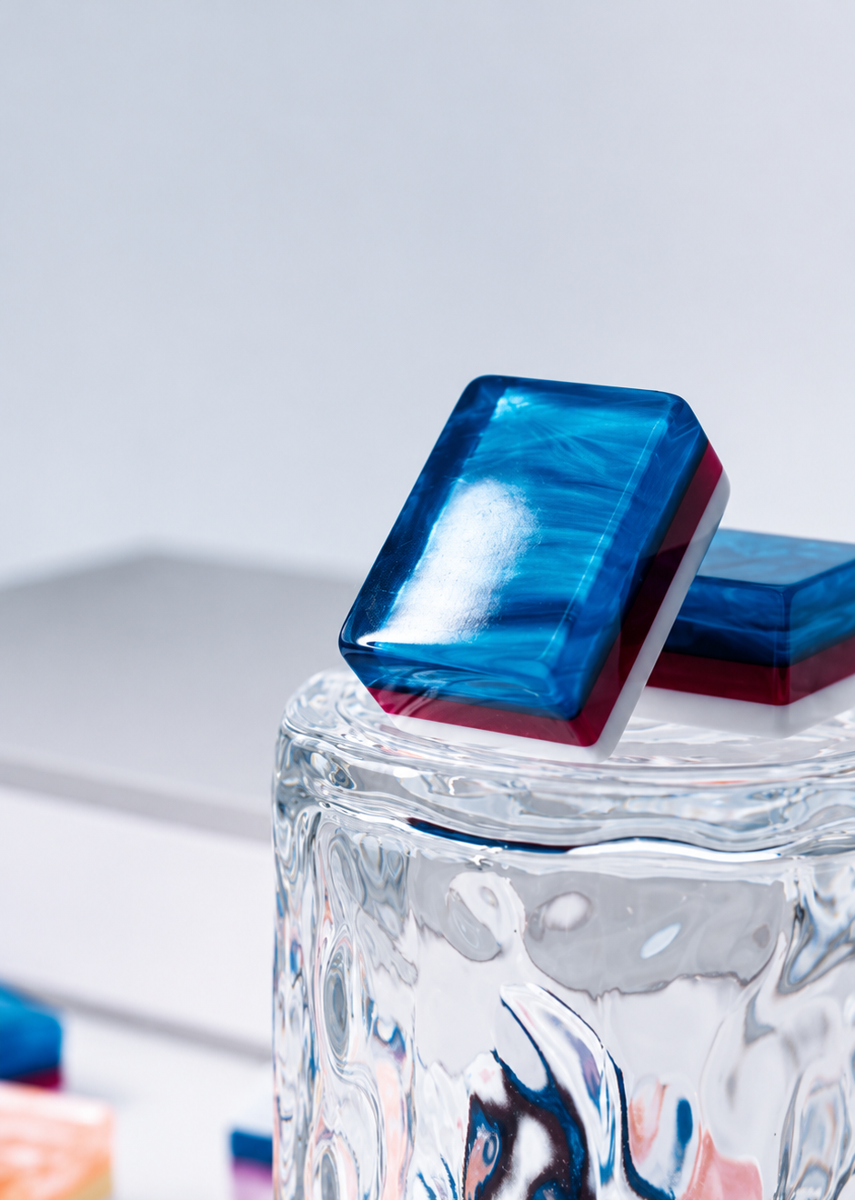
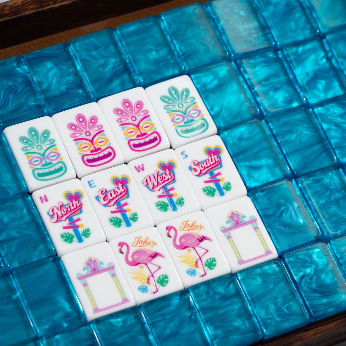
Record material codes, physical swatches or agreed reference samples for every selected tile-body color.
Check the appearance of transparent, translucent, opaque or decorative materials under representative lighting.
Confirm that all suits, numbers, flowers and Jokers remain legible against the selected backgrounds.
Review representative samples for consistent color relationships, tile-edge appearance and finish across the set.
Confirm that accessory colors, protective packaging and printed branding match the approved collection direction.
We can review your brand palette, color codes, physical samples and reference photographs. Exact appearance depends on acrylic type and available materials, so we recommend approving physical swatches and a finished sample before production.
Projects may explore opaque, transparent, translucent, pastel, saturated or decorative acrylic options. Availability and feasibility depend on material sourcing, dimensions and intended construction. We discuss suitable alternatives if a requested effect cannot be reproduced reliably.
Yes, multi-color and layered combinations can be evaluated. We review how different colors interact through the tile face and along the edges, as well as their effect on thickness, weight and symbol contrast.
Not necessarily. Screen calibration, lighting, acrylic transparency and adjacent layers can affect perceived color. A physical material swatch or sample provides a more dependable reference than a digital image alone.
We can discuss producing multiple palette variations from a shared artwork direction. Each variation should have its own approved material references and clear identification to avoid mixing specifications.
Our artwork review considers symbol line weight, color contrast, placement and the selected acrylic background. If a combination reduces readability, we can discuss alternative symbol colors or material treatments before sample approval.
Yes. We can review brand-specific packaging, protective inserts, instruction cards and coordinated accessories. Their colors and materials are considered alongside the finished tile palette and shipping requirements.
Sample development is available for discussion once the color direction and material choices are defined. Costs, lead times and revision scope depend on the project. We recommend confirming an approved physical reference before production.
Minimum quantities vary with material sourcing, color complexity, artwork, set configuration and packaging. Share your target quantity so we can assess feasible options and prepare a project-specific quotation.
Inspection can include comparison against approved swatches, visual consistency checks, edge-color review and verification of correct colorway labeling. The final inspection plan is agreed for the project before production.
Send your mood board, color references, desired tile construction, artwork and estimated quantity. We will review material options and the sampling steps needed for your project.
Start a Color ConsultationShare your color references, preferred acrylic finishes, artwork, estimated quantity, packaging and destination. Email your design files separately after submitting.


Room 03, 21st Floor, Unit 1, Building 7, Haide Garden
219 Zhongxing North Road, Daya Bay West District
Huizhou, Guangdong 516083, China